PDB Redesign
Over a 10‑week engagement, our team ClarityUX partnered with the Protein Data Bank (PDB)( a globally used scientific database supporting researchers, educators, and students) to evaluate and improve the usability of key areas of their website, especially the homepage, search results, and structure summary pages. The goal was to create a more intuitive, educational, and efficient experience for diverse users ranging from graduate students to seasoned researchers.
My Role: Student UX Researcher and UX/UI Designer
Team: Bonnie Kennedy, Mahlet Lewis, Brittany Morris, Desiree White
Timeline: 10 weeks
Skills Used: Heuristic Evaluation, User Interviews, Contextual Inquiry, First‑Click Testing, Design Studio, Prototyping
The Challenge
PDB is a widely used scientific resource, yet its interface had become cluttered, inconsistent, and difficult to navigate, especially for new or non‑expert users. Key issues included:
-
Redundant navigation across multiple menus
-
Dense, instruction‑light structure summary pages
-
Overly complex advanced search tools
-
Low visibility of educational resources like PDB‑101
-
Unclear labeling (Learn vs. Documentation vs. PDB‑101)
These challenges created cognitive load, reduced discoverability, and discouraged exploration.
Research Approach
1. Heuristic Evaluation
Using Jakob Nielsen’s heuristics, we identified issues such as:
Busy Homepage
Aesthetic and Minimalist Design
Severity rating: 2
A busy homepage may distract users from what they are looking for. The key features should be easy for users to see immediately on the homepage without scrolling.

Redundant Navigation
Flexibility and Efficiency of Use
Severity rating: 3
There are identical links in the top navigation bar, the side navigation bar, and in page content. This takes up space that could be better utilized and creates extra cognitive load on users.

Lack of Instructions
Help and Documentation
Severity rating: 3
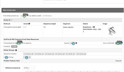
Some sections of the website, including the structure summary pages, do not provide any explanation of what content means. Users will ignore or overlook these sections.
Advanced Search
Flexibility and Efficiency of Use
Severity rating: 4
Advanced search is very complicated. The UI has multiple input fields, nested accordion menus, and technical terms. It’s cluttered and confusing. It’s a very flexible tool, but efficiency and intuitive use are lost in the flexibility.

2. Contextual Inquiry
User Interviews
Participants we included were:
-
Clinical Pharmacology Fellow
-
Former Research Assistant at Crystallography Lab
-
Structural Chemist and Professor in Chemical and Physical Sciences
-
Professor of Biochemistry & Molecular Biology
Key insights include:
-
Many users just focus on the search bar of the homepage.
-
Design is “cluttered but functional.”
-
Many users do not access PDB’s website directly and will use other tools before going to the website.
-
Adding more hints, help buttons, better tooltips, and connections to PDB-101 could be helpful for new users.
-
Users love the tutorials, but feel like they have to “hunt” for them.
-
Many users are not aware PDB-101 exists and struggle to locate it.
One-on-One Testing
Users were given tasks to complete and asked to think aloud about what they are doing, where they are looking, why they are taking actions. This provides rich qualitative data that allows us to evaluate the current user experience of the PDB website and identify usability issues. Observations revealed that users often bypass PDB’s homepage entirely, using external tools first. Many struggled to locate help resources or educational materials.
4. First‑Click Testing
-
Users were given single pages and asked where they might click to access something, move to the next stage of a process, etc. This allowed us to gain quantitative data about the usability in the current website.
-
37 users started, but only 17 completed all tasks
-
Users had a variety of professions and experience levels with PDB.
-
This might suggest that the existing site is intimidating to non-expert users.
-


Key Research Findings
What we learned:
-
Many users just use the search bar to find a molecule and download files related to it.
-
Users rarely scroll down the homepage.
-
PDB- 101 is used by many professors as a source for classroom materials.
-
There was some confusion about the navigation links for Learn, PDP-101, and Documentation.
-
Names were generally considered not intuitive.
-
PDB-101 could be class materials or tutorials on how to use PDB for work.
-
Learn could be class materials or general education.
-
Documentation could be information about how PDB works or tutorials for work.
-
-
Most users are unsure how to find help when they are unable to find something on the PDB site.
-
If users can’t find what they are looking for they often go to another website.
What’s Working
-
Search bar is easy to locate
-
Molecule of the Month is popular
-
Top navigation is used frequently
-
Mol* Viewer controls are understood
What Needs Improvement
-
Search bar should be more prominent
-
Structure summary page is too dense
-
Tooltips, documentation and hints are needed
-
PDB‑101 is not visible enough
-
Navigation labels are confusing
Design Approach
Design Goals
Based on research, the team established clear objectives:
-
Simplify the homepage and reduce cognitive load
-
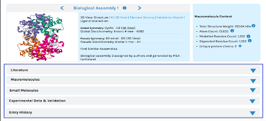
Condense structure summary pages using accordions
-
Improve visibility of educational resources
-
Standardize search filters and simplify advanced search
-
Refine navigation labels for clarity
The Process
Design Studio
Wireframing & Prototyping
Collaborative sketching sessions helped unify concepts and align on a shared vision.
The team created iterative prototypes focusing on:
-
Larger, more prominent search bar
-
Removal of redundant side navigation
-
Accordion‑based structure summary pages
-
New Learn tab for contextual educational content
-
Simplified search results with standardized filters

Final designs

Condensed Structure Summary Page
-
Accordion dropdowns
-
Clearer grouping of information
-
Added Learn tab for educational context
Simplified Homepage
-
Larger search bar
-
Removed redundant side navigation
-
Cleaner visual hierarchy


Improved Search Results
-
Standardized filters
-
Advanced search no longer pushes results down
-
Clearer refinement options


Prototype Testing
The prototype script covered:
-
PDB home page and structure summary page
-
File downloads and the 3D view
-
Help, Contact, and Documentation
-
Finding educational materials
We recruited 5 users for prototype testing
-
4 are frequent (or formerly frequent) users and mostly professors.
-
1 is a graduate student who has never used PDB.

User Feedbacks
-
Link names in navigation need continued research and have caused confusion.
-
“Resources” is too broad, but “Learn” and “Documentation” were also confusing to users.
-
Users had a lot of ideas, but little overlap in alternative name suggestions for “Resources," for example:
-
Guides
-
FAQ
-
How To
-
Help
-
Training Resources
-
-
Users like the larger search bar that has been made more prominent.
-
Users enjoyed the new accordion dropdowns on the structure summary page.
-
Users felt this would help them focus on what they are looking for.
-
New Learn tab was found to be very helpful for users, especially students.

Final Outcomes
The redesigned experience successfully addressed major usability issues:
-
Homepage decluttered with a clear search focus
-
Structure summary pages condensed and easier to scan
-
Educational content surfaced through the Learn tab
-
Search results simplified with visible, standardized filters
-
Navigation improved, though labels require further refinement
Impact
The redesign made PDB more approachable for new users while preserving efficiency for experts. The improved clarity, reduced cognitive load, and better educational integration support PDB’s mission to serve both researchers and students.
Recommendations for PDB's Future
-
Advanced search is complicated and we can learn from comparable sites, like PDBe.
-
At least one user specifically cited using PDBe over the main PDB site for search.
-
-
Further user study on the organization of the information architecture could make information easier to find.
-
Tree testing with frequent users could be beneficial.
-
Labels can be refined to be less confusing (i.e., Documentation, Learn, About, etc.).
-
-
Seeking more connections for the educational resources to the structure summary page will benefit students and the general public.
-
Continued iteration on interaction design will yield high user satisfaction.
Conclusion
This project demonstrates how research‑driven UX design can transform a complex scientific platform into a more intuitive, educational, and user‑friendly experience. Through rigorous evaluation, iterative design, and user‑centered testing, ClarityUX delivered actionable improvements that align with PDB’s long‑term goals.
Let’s
Connect
