
Associate portal
The Portal redesign initiative aimed to consolidate CHRISTUS Health’s fragmented digital ecosystem into a single, intuitive, and role‑aware intranet experience. The project addressed long‑standing usability issues stemming from legacy SharePoint sites, a limited ServiceNow implementation, and the separation of HR and IT portals. The redesigned portal serves as a centralized gateway that guides associates to the correct tools, information, and systems, even when tasks are ultimately completed in external applications.
My Role: Lead UX/UI Designer
Skills Used: User interviews, Usability analysis, Heuristic Evaluation, Wireframing, Figma design
Project Overview
Associates across CHRISTUS Health reported difficulty locating information, navigating multiple platforms, and understanding where to complete essential tasks. The absence of a unified entry point created digital friction, reduced productivity, and eroded trust in internal systems. These challenges were particularly acute for new hires, clinical staff with limited computer time, and managers responsible for approvals and task oversight.
-
User goals: Find relevant information easily, complete tasks without platform-hopping, feel supported during key moments like onboarding or life events.
-
Business goals: Improve productivity, reduce digital friction, and increase associate satisfaction and retention.
_edited.png)
Research Approach
The team conducted multi‑method research to understand the needs of diverse personas. The research methods included persona interviews and surveys.
Personas
.png)


"We need a fully integrated single front end for all HR resources, people don't need to know what feeds in on the back end. There are just too many apps. I don't know what they are for."
- Physician, CHRISTUS Hospitals
"When associates have babies, and other big life events, we have an opportunity to connect in a meaningful way and give pertinent information more proactively."
- Associate, CHRISTUS Corporate HQ
"As a manager, I want to be reminded of what I need to do and have one designated place to check on upcoming tasks."
- Manager, CHRISTUS Talent Team
"As a nurse, I am not familiar with My CHRISTUS Life, and didn't realize I had access to submit my own tickets or chat with support. Clinical staff are not checking emails. All information is passed face to face during morning huddles."
- RN, CHRISTUS Trinity Clinic
Key Findings
-
Too many digital destinations created confusion and forced associates to remember where each task lived.
-
Search was ineffective and often returned irrelevant or outdated content.
-
Mobile access was limited, especially for clinical staff.
-
Managers lacked visibility into tasks, approvals, and associate needs.
-
New hires struggled to understand where to begin or how to complete onboarding tasks.
Research surfaced distinct needs across personas:
-
Clinical associates required quick access, mobile‑friendly tools, and clear guidance due to limited computer time.
-
Non‑clinical associates needed streamlined navigation and fewer redundant applications.
-
Managers needed reminders, consolidated task views, and a single place to monitor approvals.
-
New hires needed a guided, role‑specific onboarding experience.
These insights informed the portal’s structure, content strategy, and personalization model.
Information Architecture
The IA redesign focused on reducing cognitive load and aligning navigation with user mental models rather than system structures.
We restructured the portal to reflect how associates think, not how systems are organized.
-
Navigation strategy: Role-based dashboards, simplified categories, and federated search
-
Content strategy: Clear labeling, consolidated access points, and contextual guidance
-
Artifacts: Card sort analysis, sitemap drafts, and wireframe flows
Card Sorting Exercise

Updated Sitemap

IA Deliverables
-
Revised primary navigation centered on My HR, Applications, Career, and Support
-
Role‑based dashboards for associates, managers, and new hires
-
Content consolidation from SharePoint, MCL, and the intranet
-
Federated search model to unify results across systems
-
Tiered page templates (Home, Landing, Leaf Level) for scalable content organization
Design process
UX Auditing
We evaluated the existing IT & HR portals to make sure to include all existing features into the new one and also other major apps/portals that need to be integrated.


Wireframes
The design phase translated research insights and IA decisions into wireframes and high‑fidelity mockups aligned with ServiceNow’s design capabilities.

UI Designs
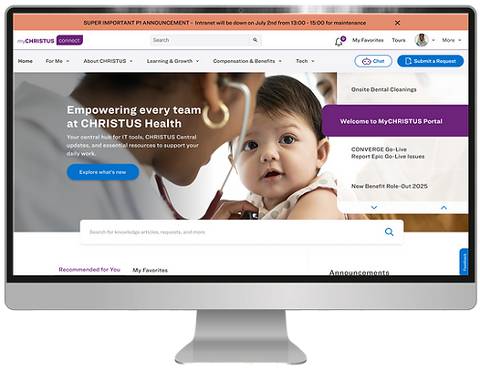
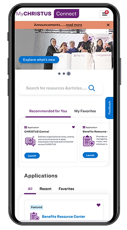
Final design screens
Below are the final and polished UI designs after reviews with stakeholders, and development team

_edited.png)
Testing & Iteration
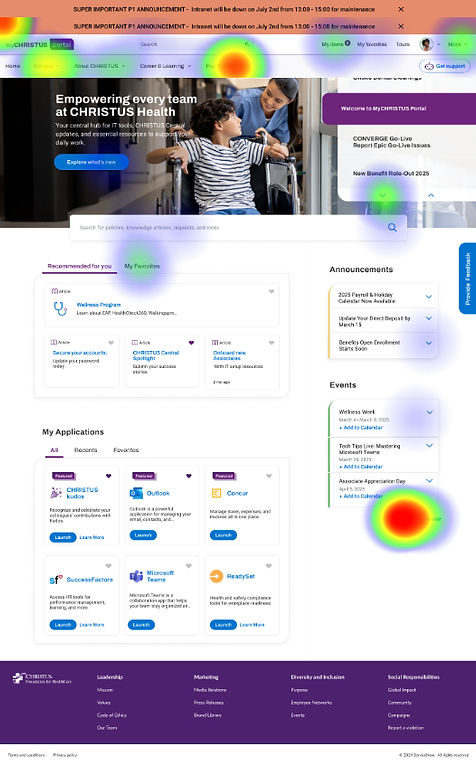
A comprehensive usability testing phase was conducted to evaluate the effectiveness of the redesigned Purple Portal experience. This included both task‑based usability testing and a large‑scale unmoderated Maze study to validate navigation clarity, task efficiency, and overall usability
Unmoderated Testing with Maze
In March, the team conducted an unmoderated usability test using Maze with 43 members of the Experience Activators group. Participants completed 11 core tasks that reflected real associate workflows, such as locating HR resources, accessing applications, and using the new Get Support feature.
Maze provided both quantitative and qualitative insights, including:
-
Task completion rates
-
Time on task
-
Click paths and navigation patterns
-
Drop‑off points
-
Open‑ended feedback
This allowed the team to identify friction points at scale and validate whether the redesigned structure improved efficiency.
Click here to view the test report:
Moderated Task-Based Testing
In parallel, the team conducted moderated sessions to observe how associates interacted with the new portal format. Participants were asked to complete common tasks they perform daily, enabling the team to assess:
Key Findings
Testing revealed several important insights:
-
Users completed tasks more quickly and with fewer navigation errors compared to the legacy experience.
-
Clearer labeling and simplified navigation significantly improved findability.
-
Participants responded positively to the tiered page structure, noting that it reduced guesswork.
-
Heavy reliance on 'Search' and 'Virtual Assistant' to find information.
-
Some modules required refinement for clarity, particularly within the Applications and Support pathways.
-
Managers expressed a strong interest in having a centralized dashboard for approvals and team‑related tasks.

Design Refinements
Based on testing feedback, the team implemented several improvements:
-
Adjusted navigation labels to better align with user expectations
-
Refined the placement and hierarchy of quicklinks and favorites
-
Improved the clarity of support pathways for HR and IT
-
Enhanced the visibility of task‑related modules
-
Streamlined page layouts to reduce visual noise
These refinements strengthened the usability and scalability of the design ahead of development.
Outcomes & Current Status
The redesigned Purple Portal is now in active development for the Phase 1 release, which includes the foundational navigation, core templates, and unified access model. Early stakeholder reviews and user testing indicate strong improvements in clarity, efficiency, and overall satisfaction.
Phase 2: Next Steps
The team has initiated Phase 2 with a heuristic evaluation to identify remaining usability gaps and opportunities for enhancement. The next major focus area is the introduction of role‑based dashboards, beginning with the Manager Hub — a dedicated space designed to consolidate approvals, team updates, and managerial tools into a single, intuitive interface.
This next phase will continue to build on the project’s core principles of clarity, personalization, and guided task completion.
Let’s
Connect